Report Graphing
In order to display a graph on a report you need to ensure:
1. You set the Report Type to Summary Report and not Tabular Report.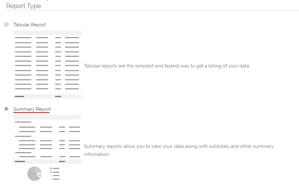
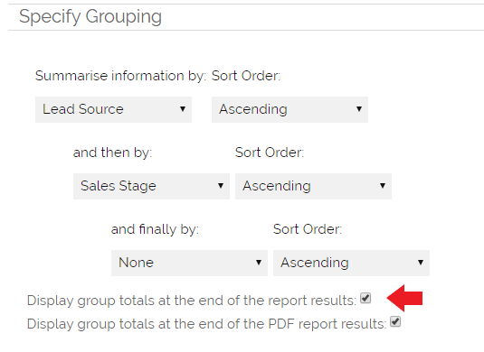
2. You specify at least one option under 'Specify Grouping'. This is to set the X (horizontal) axis.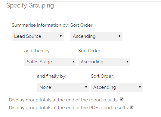
3. To specify the Y (vertical) axis you can either:
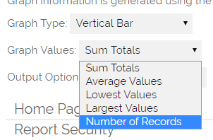
a. Set an option under 'Choose Columns to Total' and match this to the corresponding setting in the 'Graph Value' field of the 'Specify Graph' options.
So for example if you tick a 'sum' option under 'Choose Columns to Total':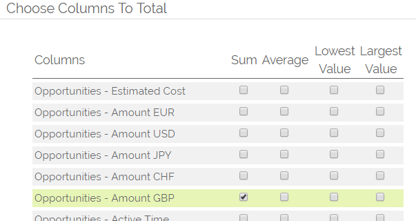
then set 'Sum Totals' under 'Graph Values':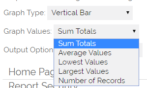 OR b. Alternatively if you simply want a count of each type of record you need only set 'Number of Records' under 'Graph Values
Displaying a Report on the HOME PAGE
1. To ensure the graph appears on your Home Page you need to specify a block in which to show the graph which is active on your homepage. This is set under the 'Reports Block' option under 'Home Page Settings'. By default 'Reports' and 'Reports 1' should be active for your profile.
As the image below shows, you need to tick the "Show On Home Page" box, select the Reports Block to display, select the display type, and specify which Users or Profiles can see this Report on their Home Page.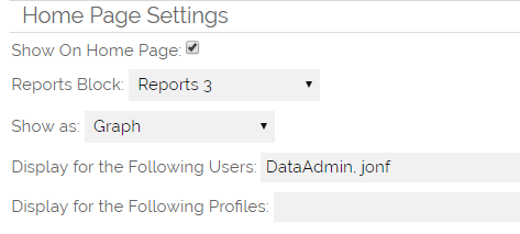
'Show as' Options:
- Totals - this just displays the totals created on the Report, so gives a snapshot of information, without the detail
- Grid - this allows the detail that builds the Report to be shown in a Grid view, similar to a traditional Report in OpenCRM
- Graph - this just displays the Graph that has been set for this Report
- Full - selecting Full will display ALL THREE options above, the display will show the individual rows in the Grid, display the Totals and also the Graph.
2. Once you have set-up the 'Home Page Settings' you will need the make sure the reports module is installed on your home page. You can set which blocks are active on your profile. This is done by going to My Account and selecting Homepage Order. Items in the top block are shown on your Home Page those in the bottom block are not, you can drag and drop items between the blocks and adjust the positioning.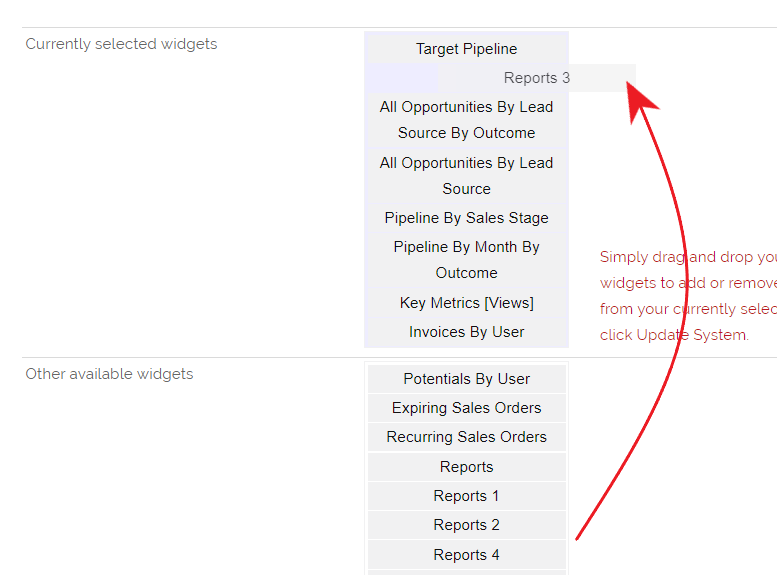
3. Once you have done this, you are able to view the Report in graphical output on your Home Page, or on the Home Page of any of the specified Users or Profiles.
About HighCharts
HighCharts is an improved graphical component. It is enabled on new systems by default. If this is not set up on your system, you can enable it by going to Settings > Additional Settings> Reports. From there you can tick the box to Enable HighCharts.

One of the real benefits of HighCharts, besides their appearance, is the ability to click a column, bar, or pie segment to drill down to a secondary grouping. This secondary (or tertiary) grouping is set under "Grouping" when you are setting up your Summary report.
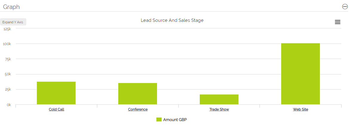
For example, the below graph shows the Total Amount for Opportunities by Sales Stage.
By click on one column, in this case that of "Web Site," we can see the secondary grouping level of the various Sales Stages.
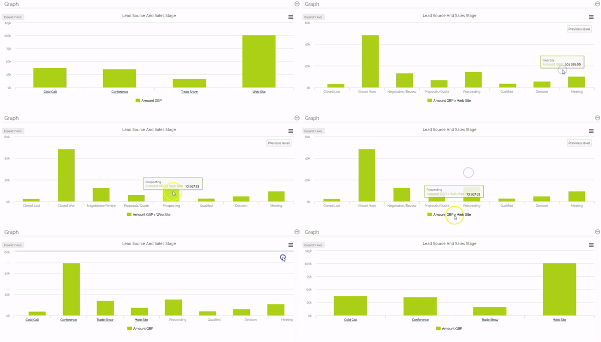
To get back to the primary level, we can simply click the "Previous Level" button on the graph itself.
Breaking a Report Down by Month and Year
If you want to create a report that shows a list of Monthly sub Totals and then graph this information to show trends, this can be done by following these steps. These steps and variations on the values can be used to produce any 'time period' reporting and associated graphs.
1. Create a NEW Summary Report as above
2. Add the modules that you want to report on (We will use Opportunities to create a sales forecast report)
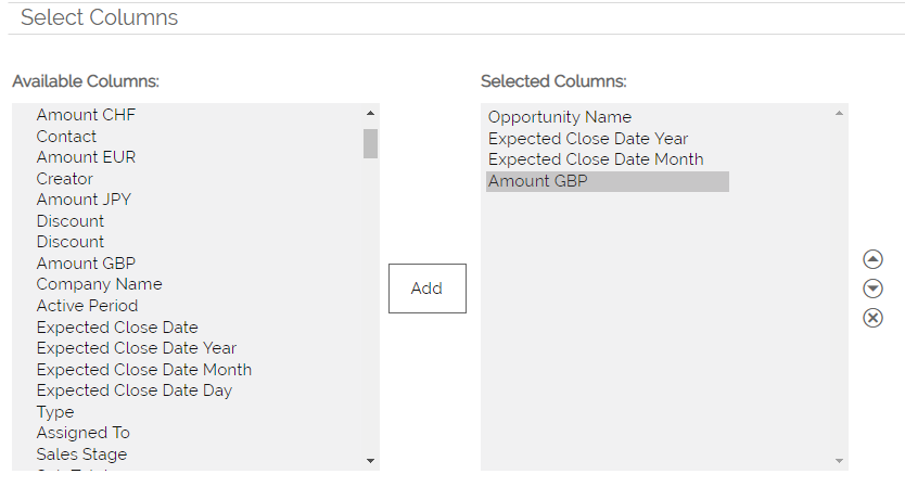
3. Specify your Columns - use the additional date parameters (Year/Month/day) We will use the Year and Month values, this will allow us to display grouping by Month and differentiate between different Years.
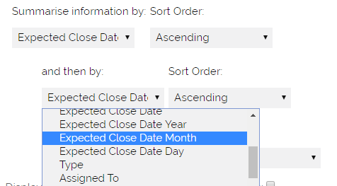
4. Specify the GROUPING - we will use Expected YEAR and then MONTH
5. Choose Columns to Total - you can include Sum, Average, Lowest and Largest values as part of the report summary. if you are reporting on a Sales Module (Invoice, Sales Order or Quote) you can also run calculations on the Product Margin field.
6. Specify Criteria - what data do you want to include - we will use 'Opportunities - Expected Close Date > Next 120 days'

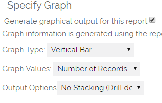
7. Specify the Graph - we will use a Vertical Bar style, however, you could use the 'Line Style' to display period trends.
8. Save and Run - name the Report and give a more detailed description (if required).
This will produce a Report that displays;
- List of data that makes up the Report
- Summary totals for the groupings selected
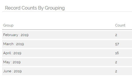
- Graph that displays the grouped values
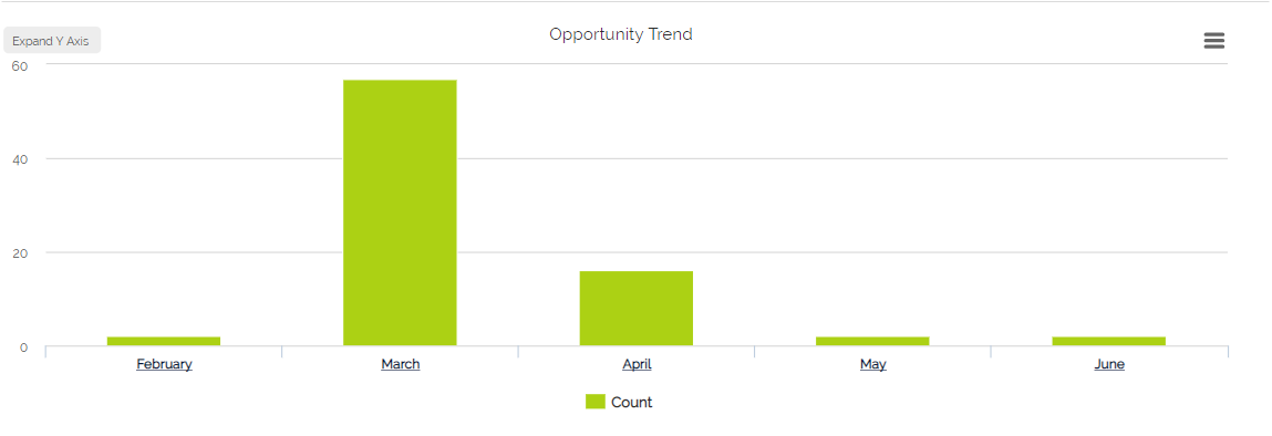
You will notice that the Summary details lists an overall total and then the Year/Month sub totals, displaying any column totals that you have set (Sum, Average, Lowest and Largest).
The graph will displays these same sub totals.
Need More Help?
If you have any questions, just start a Live Chat, "Click" on the Chat Icon in the lower right corner to talk with our support team.


